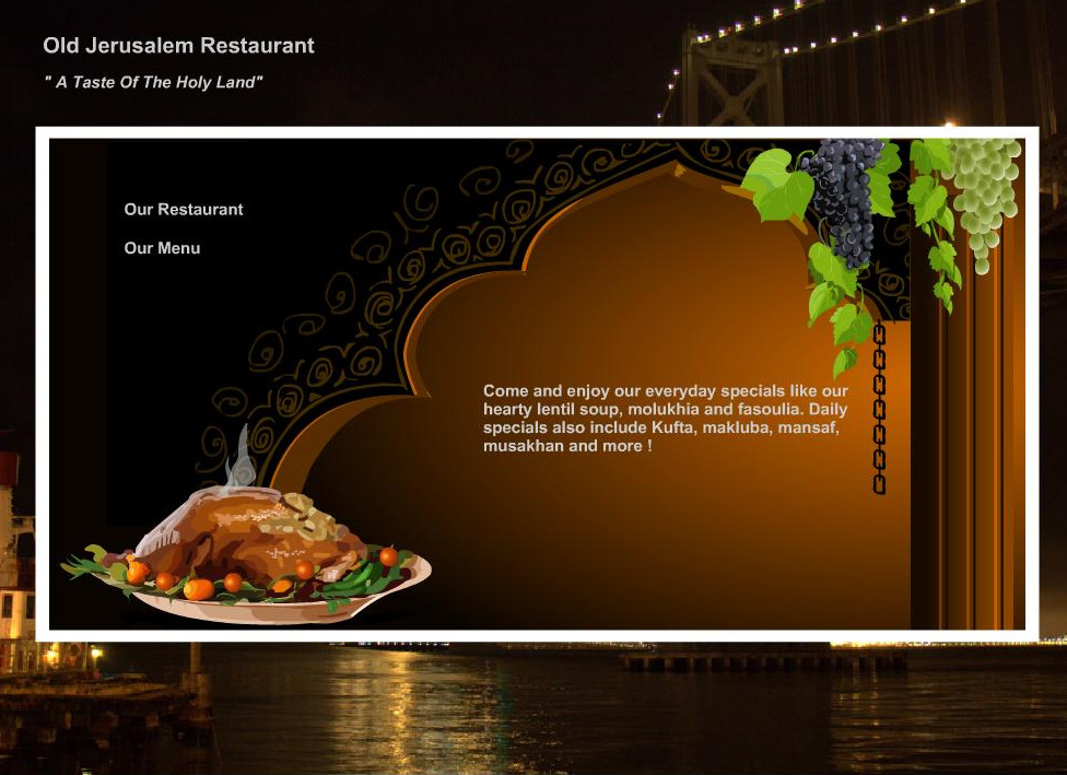
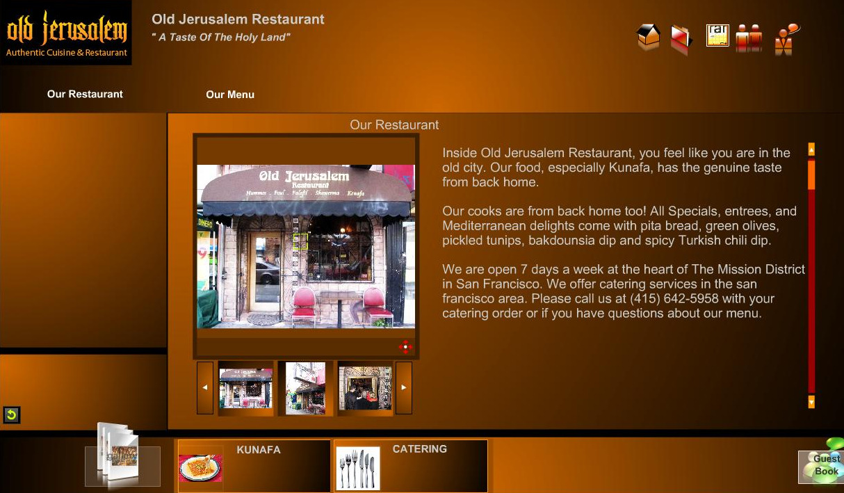
While it might not have all the chuptzah of the new Bay Citizen community news experiment, the masters of Mediterranean dining at Old Jerusalem nonetheless have a website that refuses to be left out of the discussion. Not content to merely the hold the title for Best Falafel in the Mission (according to vegansaurus!), they also appear to pursuing the award for Spiffiest-Looking Restaurant Website.
Not only does it play scientific sounding beeps and boops whenever you mouse-over various icons, but a video demonstration by a mildly attractive virtual tour guide instantly materializes to walk you through the various features, ensuring you don’t get caught on the wrong side of the checkpoints. Of course, the discerning veiewer sees through all this pomp and circumstance to the generic interface overlaid with OJ graphics, but you still have them an A for effort.
Does anyone have any other favorite Mission restaurants or local businesses with hilariously incongruent websites?
[Link, thanks Travis!]
Previously:

