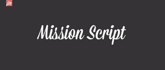
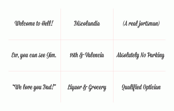
If you can’t already tell, I’m a huge fan of local typographer James T. Edmondson and his contributions to the world of letters. Well, James has done it again. Mission Script is a tribute of the hand-painted signage of the liquor stores, taquerias, doughnut shops, and bodegas of our neighborhood, and it’s the first typeface to come out of Lost Type’s Mission Collection.
You can download Mission Script (and a bunch of other snazzy typefaces) over at Lost Type. And do consider making a contribution if you’re really going to use it.


Good god this is stupid.
Do people really think shit like this is important? Or cool?
I do.
Thanks Helen, much appreciated.
I do. Get a grip Poop head, theres more to life than just what you’re interested in.
Yes it is both important AND cool.
And pretty.
and objectively a bad typeface
Says: http://genki-genki.com/
Thank you, now FUCK OFF.
Nice job!
Mission Script looks like an improved Lobster.
Thanks, Helen!
Good looking “hand painted” inspired type here… but not really Mission influenced or inspired much.
This guy holds down liquor store signs pretty well in the mission:
http://goo.gl/maps/AUSv
http://goo.gl/maps/F9qk
http://goo.gl/maps/y9TJ
Another good one:
http://goo.gl/maps/zE7N
Mission Thrift
http://goo.gl/maps/81Tg
This guy does window splashes and is pretty prominent…
http://goo.gl/maps/VsMl
http://goo.gl/maps/4aG2