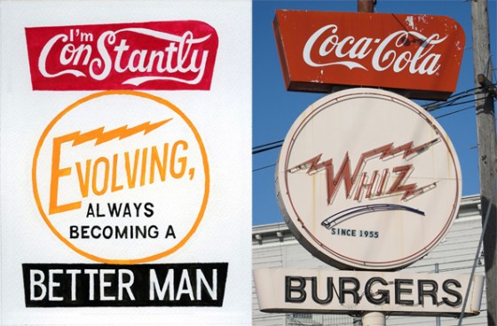
Apparently, Mission signage is quite the font of inspiration these days (pun entirely intended). Previously, there were two typeface projects, and even before that, our lovely sidebar headers.
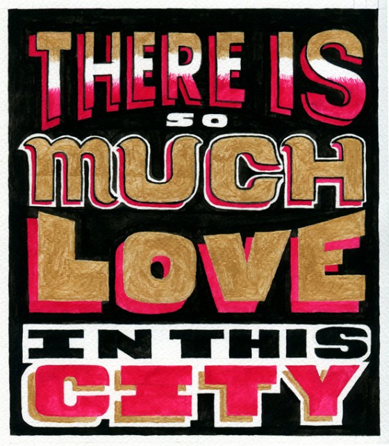
Artist Pablo Medina is working on a series of paintings that combines the hand-drawn aesthetic of Mission signage with very personal lines from his journal. I’m especially fond of the Whiz Burger one above, and I can’t help but agree with this one:
Here’s what Pablo had to say about our ‘hood:
I arrived in the Mission District from the airport on a Friday night, and the neighborhood had just the perfect balance of a lot happening and nothing happening. A couple of bars were buzzing, some kids were fixing their bikes, and some local Mexicanos were sitting on their stoops listening to reggaeton. My kind of place. Hand-painted signage was everywhere.
Read the full story over at Imprint.


Love it, beautiful work Pablo. I guess my crit would be that if the type is so intertwined with the actual place/event that it becomes…forever derivative, thus attached to the symbol of the original place. Maybe that’s what you want?
Great stuff, love hand illustrated type.
I’ve never thought of signage quite like that. But I can certainly see the connection now. Can a brand really have that great an effect on us? Thanks for pointing this out. I’m looking forward to seeing more like this in the future.
the manufacturer of your lift truck will most likely also offer training options as well.osha requires also state that all forklift drivers must be properly licensed and wear appropriate protective gear. 22.178 forklift accidents are a very common workplace happening.