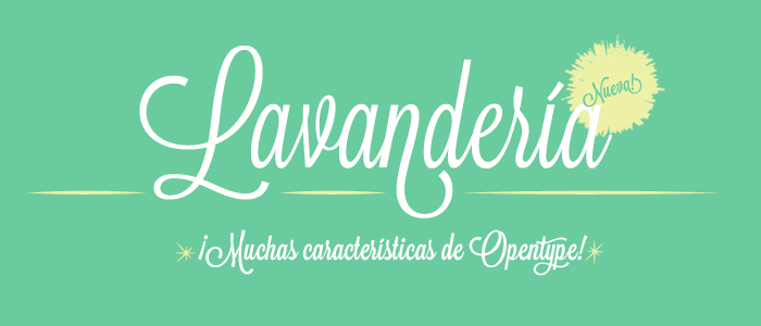
Local designer James T. Edmondson has created a new font based on the lettering found on laundromat windows in the Mission, aptly named Lavanderia. Fancy!

Here’s what James had to say about his font:
Laundry is an incredibly tedious task—the antithesis of glamour, so I have massive appreciation for the guy that decided to letter the window with a script that captures all the essence of what a laundromat lacks. Excitement, passion, love. It’s all in that script.
How nice it is to create something beautiful, where boring, stagnant lettering would have easily sufficed! My latest typeface Lavanderia is a celebration and a tribute to the enthusiasm that influences those who go above and beyond to create beauty where there is none.
Inspiration came from San Francisco’s Mission District, a vibrant and at times foul smelling part of town, rich with dive bars, taquerias, and unemployed twenty-somethings who look extremely creative but actually do very little. It’s a magical place.
Download Lavanderia here, and consider leaving a donation. Making fonts is hard!
Those Lost Type fonts seem pretty nice; I’ll have to take a closer look. Thanks for the tip.
James!! Congrats, this is almost like being Mission-famous or something.
JAMES IS THE BEST EVER.
Another lovely typeface, go James!
you’re a type design beast.
wow lost type is amazing.
james is the worst. i hate him and i hope he dies.
James is the best typographist
So throw up your f****n fist
Thee Immanuel Kant of font
Making suckas wish
That they could do it like him
This is the best thing ever.
singapore personal loan