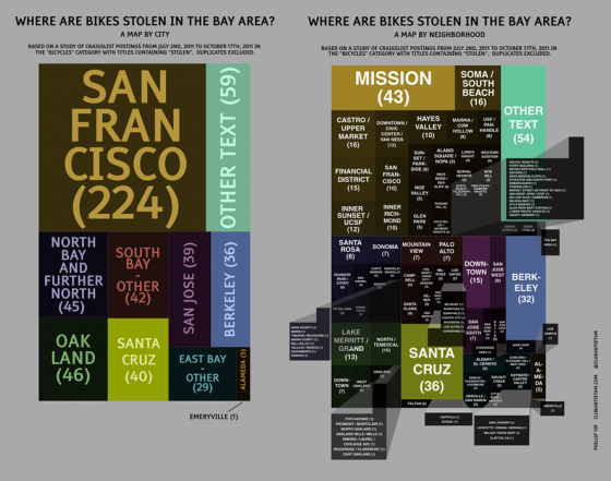
MM reader Phil created this handy infographic to demonstrate the number of reported bike thefts during a four-month period in neighborhoods in the Bay Area, a much to our shock and surprise (j/k), the Mission ranked in at number one! At least now you know exactly where you shouldn’t leave your bicycle. Honorable mention for Emeryville.
Find the bigger versions of the charts as well as detailed explanation of methodology here.

it would be so much better if they were roughly geographically in the right place, like East Bay being to the right… More so by the neighbourhood map – I mean downtown is slap bang in the middle next to San Jose and Palo Alto – is that downtown SF (obviously it is)?
It looks like that is just a sampling of where people who post to Craigslist had bikes stolen. I’m not sure how well that would correlate to the actual number of bicycles stolen, just the number of people who had their bikes stolen but decided to complain on craigslist about it?
as the image clearly states, it is a sampling of people who reported their bikes stolen on craigslist. thanks for repeating the obvious.
The IMAGE clearly states that, however the post does NOT. So… you’re welcome.
I MUST HAVE EVERYTHING EXPLAINED TO ME OR I CAN NOT COMPREHEND
Hey, don’t mention it Andy, It is just one of the many useful services I provide!
no, i was doing an impression of you.
Their use of the word “map” can only be explained with a definition that renders the word meaningless.
why, EH,
You guys are right – it’s not a map in the traditional sense. I should have labeled it a “Treemap”. I used “map” as in this definition: http://en.wikipedia.org/wiki/Map#Non_spatial_maps
Herr,
You’re absolutely correct – the treemap only includes people who bothered to post about their stolen bikes on Craigslist. I don’t know how well it correlates either but I don’t think we have any really good datasets at this point – not everybody compiles a police report nor submits to the stolen bike registry.
Agreed.
yeah, that wikipedia definition doesn’t apply to what you’re trying to do.
Err.. ok.
http://en.wikipedia.org/wiki/Treemap
sorry, but these are a mess. it should look more like a map itself, and the size of each block should correlate (roughly) to the amount of posts for that region. the only obvious one is SF on ‘map by city’ but the blocks for oakland and santa cruz are roughly the same size (was that what you were trying to do?). Should be more obvious variation. it should be more clear that these are related to the numbers of posts. don’t hyphenate the city names. you refer to ‘other – text’ but aren’t these posts? if i’m asking these questions it’s because the chart isn’t clear. good idea though
datavis expert,
Thanks for the tips! You’re right, the areas of the blocks should correlate to the number of posts. The blocks for Oakland and Santa Cruz are roughly the same size because they have relatively the same number of posts – 40 vs 46. The difference of 6 is pretty tiny compared to the total number of data points (633 from what I recall) and the number from San Francisco (224).
Either way, you you’ll have to make adjustments to make it visually obvious there’s a difference. You have one large data set and the rest are smaller and don’t vary that much between them.
KTVU just now reported on this