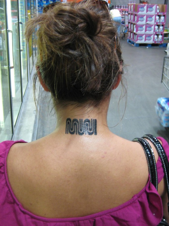
From a graphic design perspective, obviously the Muni logo is a winner. And Muni is pretty great in a number of ways. And tattoos are cool. What’s not to like?
Muni Diaries has this and a few more in a gallery of Muni-celebrating ink.
(Thanks, Sally!)

MUNI tattoo at Costco? That’s kind of ironic.
What, you don’t think you could drag a 48 pack of tomatoes, a crate of paper, and 10 pounds of cinnamon rolls on Muni?
This is just unspeakably depressing.
Well said, I really hope it’s fake.
That is so rad! I endorse this.
From a graphic design perspective, the FedEx logo is pretty rad, too (subliminal arrow omg!). But that doesn’t mean you should get it tattooed on the back of your neck.
Handy for when you’re found in the gutter after being hit by a MUNI bus. “Ma’am, what happened?” *Gestures to neck with broken arm…*
grrrrrossssss
haha you win, we all lose.
1) Looks a little bit crooked. But would have to see in person to confirm.
2) Definitely do not want to see this person to confirm.
3) Sort of looks “shiny new” like some tats do, but I don’t see any red around the edges.
4) It’s a tattoo of a horribly ran public agency.
Dare I say fake tat?
*Did not mean to place MUNI’s horrible status in the past tense.
I daresay that my first thought was fake tat. Too shiny with no agitation. Let’s hope that it’s a spendiferous joke.
Yeah, I’m gonna second you on the fake tattoo. Too shiny and kinda off-level.
The mark of the beast!
so like, does she random hit shit, break down, and run over/kill pedestrians?
does she fall asleep at the wheel?
Ran a train on her.
I once almost bought one of those brown muni jackets with the logo on the shoulder. Cool looking jacket. And then I thought, how dumb would I feel when exclaiming “F*ING MUNI! TYPICAL!” whilst wearing the jacket. Which happens most days.
UPDATE
Muni Diaries has an interview with Muni Tattoo Lady.
http://www.munidiaries.com/2011/04/11/hey-thats-my-tattoo-girl-reunites-with-her-muni-tattoo/
That’s rad. I really do think it is a great tattoo, though it looks like the ink is bleeding quite a bit as it ages, sadly.
“What’s not to like?”
That’s one of my favorite smoochin’ spots, that’s what. Wouldn’t be smoochin’ on a MUNI logo, I can promise you.
It is a sweet logo. But I stopped riding it a while ago after getting a bike. I think they should combine the duties of social workers and bus drivers. It’s a rough scene.