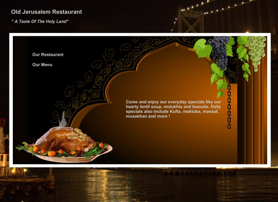
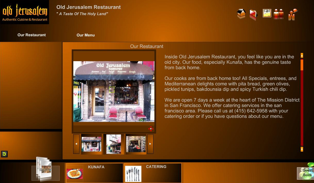
While it might not have all the chuptzah of the new Bay Citizen community news experiment, the masters of Mediterranean dining at Old Jerusalem nonetheless have a website that refuses to be left out of the discussion. Not content to merely the hold the title for Best Falafel in the Mission (according to vegansaurus!), they also appear to pursuing the award for Spiffiest-Looking Restaurant Website.
Not only does it play scientific sounding beeps and boops whenever you mouse-over various icons, but a video demonstration by a mildly attractive virtual tour guide instantly materializes to walk you through the various features, ensuring you don’t get caught on the wrong side of the checkpoints. Of course, the discerning veiewer sees through all this pomp and circumstance to the generic interface overlaid with OJ graphics, but you still have them an A for effort.
Does anyone have any other favorite Mission restaurants or local businesses with hilariously incongruent websites?
[Link, thanks Travis!]
Previously:


Wow.
I love that the tour is generic, so they can roll it out on all of their websites. Eventually, they will reach all web surfers with their instructions on how to navigate a website.
[...] The texture was perfect, with a slightly crispy outer shell coating a soft yet firm center. Both the falafels and the tahini are made in-house every day, and are featured on a menu along with lamb and chicken shawarma, available on either pita or lavash for $7-8. Give it a try yourself to see how it compares to Truly Med and Old Jerusalem! [...]
I like the helpful info you provide in your articles.
I’ll bookmark your blog and check again here regularly.
I’m quite certain I will learn lots of new stuff right here!
Good luck for the next!
Here is my blog post; Rosie Siering