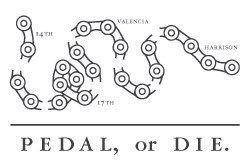
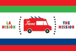
As part of their neighborhoods issue, Good Magazine hired Volume Inc. to design some neighborhood flags. Here’s what they came up with for the Mission:
Bikes and tacos! Clearly these guys are thinking OUTSIDE OF THE BOX!
Personally, I think they should have consulted us for a flag design consisting of scenes from the Mission Mission top posts of all time. Who wouldn’t want a flag of a lady shitting on her house while a scantly clad woman struts down the street drinking moderately-priced Kombucha and a BART train speeds by in the background (passenger with a visible boner in window)?
Oh, and this flag would never fly from a pole, it would always be presented draped over a life-size marble rendering of Sasha Grey.
See the rest of the series (mostly not-SF) neighborhood flags here.
Thanks Elizabeth S.!


You want Mission spirit? How about “rent cheap or die”? That’s the bottom line. A whole lot of people who have been here forever, supporting the “Mission scene” with sidewalk stencils and spray-painted wall slogans, would have been somewhere else in a flat ECG if the rents elsewhere had aligned with their incomes. Me too, probably.
I was thinking:”Pose or die.”
note to self: never hire Volume, Inc. for your graphic design needs. Never.
I have the John Adams theme running through my head now as a fixie bike rides on by…